Welcome to the mobile world, a world, where more than half of online traffic comes from mobile devices. And also, where more than half of people are shopping online. And that’s today’s case – a few words, about optimizing mobile design for e-commerce.
Make it simple
Let’s start from the basics. Your site on mobile devices should include only the most essential features to make a purchase. Don’t put there all the features, because it could become difficult for the user to find their path to purchase.
Make sure, that your layout of the site is easy to navigate on mobile devices. That means every button or CTA should be quite large and accessible on any size of the screen.
Put all the additional information below, or hide it, so they will not distract the client.
Use a color scheme
Use colors defined to your brand, but remember, that they must be nice to the eye.
💡If you have red or blue primary colors – use related to them shades. For example light blue, or a little less bright red. Don’t put them as a primary color. Use white, or gray for the background, including your brand design as additional colors, for buttons, titles, and other non-interupting eye elements.
Creating standing-out color buttons will help the visitors click on them. In other words – it is easier for visitors to find a click what they need.
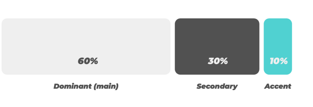
Use 60/30/10 rule
It’s important to use the 60/30/10 rule. Not only in design but today we will focus on this.
It’s the rule, 60% of the colors are nice to the eye (the default dominant color), 30% is a secondary color and the last 10% is an accent color. It allows you to keep the balance and hierarchy of colors.
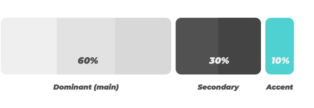
As I mentioned before, you can also use different shades of that color, and create your own palette. It helps with multi-box design elements.
💡You can make it by changing the lightness value of a specific color, to make it more, or less bright. The accent color, which covers only around 10% of all the visible content, in my opinion, should stay the same.
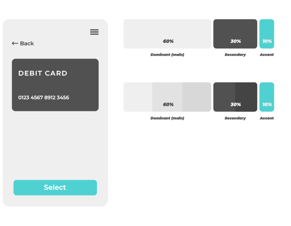
Let’s apply then this beautiful rule to our simple design, and let’s put the accent color onto the CTA button.
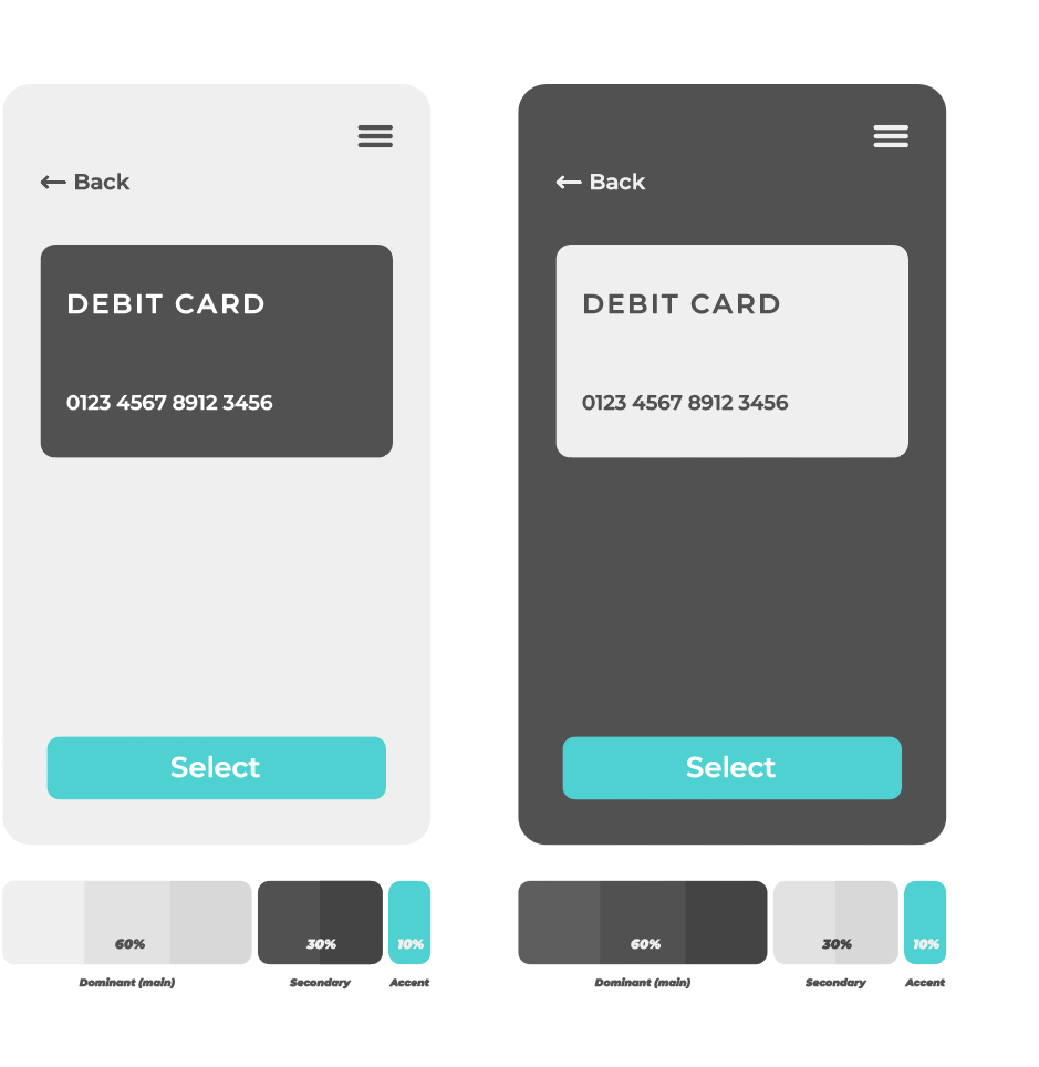
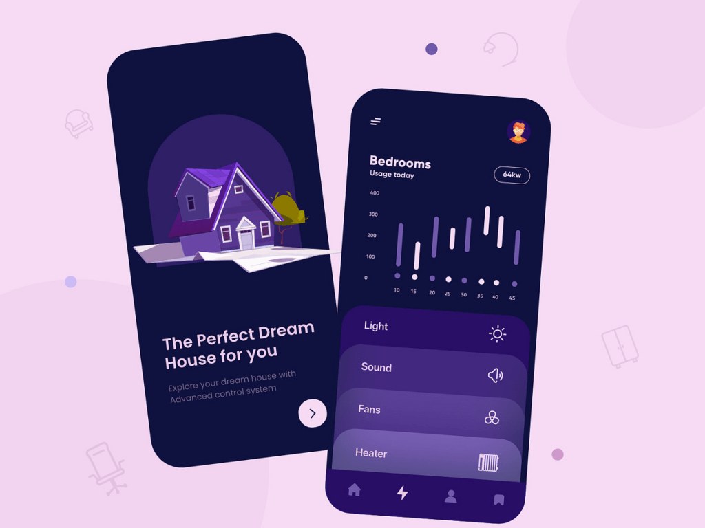
Dark theme
One trend, that has never disappeared is the dark theme. A lot of people love it. It’s just the part of every decently done page. It’s nicer to the eye and enhances the battery life, especially on OLED screens, which are in almost every phone right now.
Here is an example of a dark theme, according to the previous designs.
How many times have you been lying down with the lights off and scrolling through your phone?
Another advantage of dark mode is that it’s a lot better through scrolling at night. It helps the eye to get used to the browsing site when everything around is just dark.
There is also a second, real-use example right below, where you can find that rule, and shading options with the lighter purple color on categories.
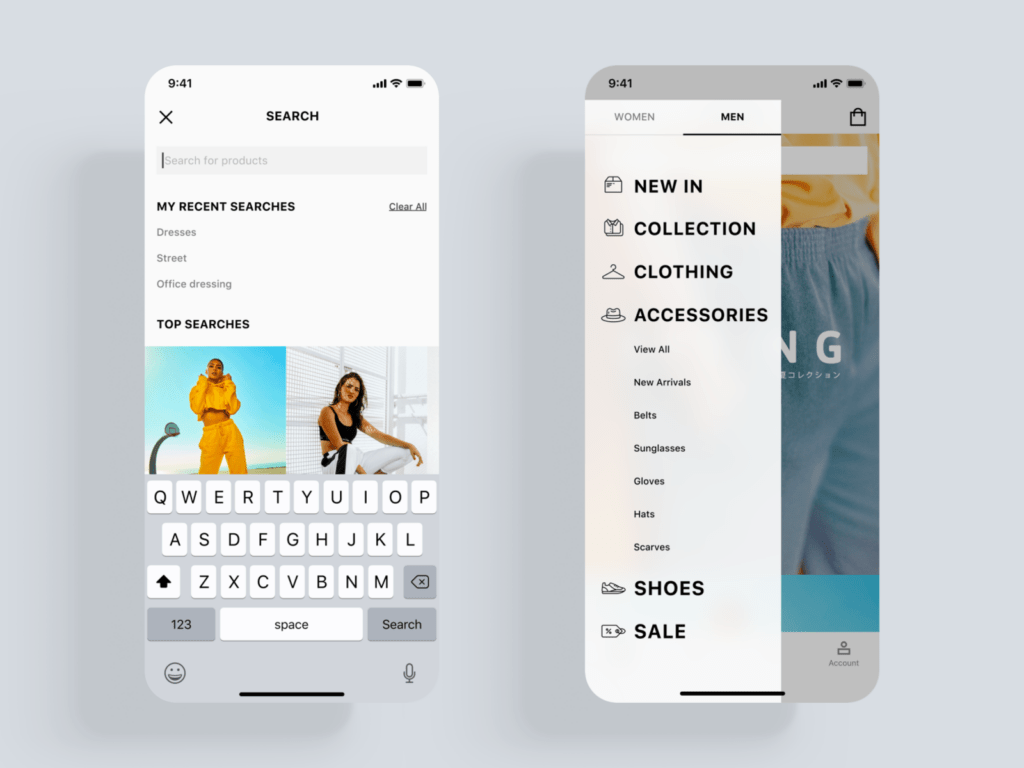
Menu navigation
Not only the menu, but make sure, that layout of your pages is easily accessible and simple to navigate on a smartphone.
But navigation menus can be sometimes tricky, considering, that we haven’t so much free space. So what you can do in this case?
- Try to avoid a lot of categories, especially these less-important
- Keep only the most necessary things
- You can squeeze the less crucial stuff into one subsection, or a button, to keep it simple and clean
- For more specific, detailed options try organizing it by implementing the sub-menu.
Optimize and style your image
While browsing the store, one of the most important things you look at is a photo of the product or service you are trying to buy.
That means it should strongly attract the attention of buyers. You can achieve this by taking simple and clean photos of the product. The photo should have good light and detailed elements and cleanly present the product. Avoid situations, where there are many objects in the background – it doesn’t look good.
Use a responsive design
Make sure, that responsive design works well.
It’s important because your site should work well on all different sizes and resolutions of today’s mobile phones. It should adapt to the screen size while it’s being viewed and resize when the user changes the view – for example, split the screen.
Don’t forget, to format the text. It should be centered, or aligned to the left, which helps the readability of your site. The aligning depends on the site content, like titles, buttons, etc.
Don’t use pop-ups
Popups aren’t common in mobile design, because of their size. They cover almost the entire screen, which distracts the viewer from the desired content. A second reason why you shouldn’t use popups is because they are hard to navigate, and in most cases – almost impossible to close, because of their small close button in the corner.
While they work well on desktops, it’s not a good idea for mobile devices. Try to change the way to present the content – you can do it for example in banners.
Summary
Now you can focus on implementing mobile design for e-commerce by following these best practices. As a result, you can create an e-commerce experience that is not only visually appealing but also functional and convenient for your mobile customers.
Remember, a seamless mobile shopping experience translates to increased customer satisfaction, loyalty, and ultimately, conversions and revenue. So, invest in your mobile design, and watch your e-commerce business thrive.
GET IN TOUCH
Ready to transform your online store into a mobile shopping center?
Let’s talk about how we can help you.


