Many online stores are facing problems with abandoned carts. Customers can add many things, then suddenly leave them behind, forgetting about them, and never returning. Most research shows, that nearly 70 to 90% of people abandon their carts.
Improving the cart & checkout interface and user experience can convert more carts into orders.
Why do customers abandon their carts?
Before fixing the design, we need to understand, why customers are leaving the website without buying. There are multiple reasons, but the most recent and repeatable are:
- Slow loading – if it takes too long to load, customers lose interest, or put it behind for later
- Hidden costs – unexpected costs, that appear only at checkout, for example, shipping fees, abroad taxes (VAT)
- Complicated checkout – too many steps, from “buy button” to payment
- Lack of trust – insecure website, no security signs, lack of regulations and brand information
- Forcing to create accounts – many customers don’t want to create an account to buy something once
Basic rules for cart design
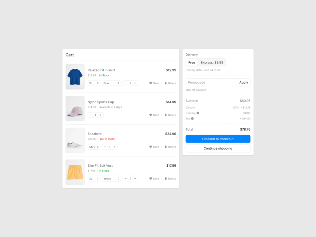
The cart design should be simple, transparent and consistent. It should keep all the things and features clear and visible to the customer. They must know what exactly they added to the cart and how much it will cost. Pricing should be clear, right next to product titling.
It’s also important to show product details, colors, quantities, and all the features, that customers have selected. Showing it with small, organized icons should help keep the cart organized.
Buttons like “Checkout” or “Proceed to checkout” should easily stand out from the rest, leading users to the payment page.
A simple and fast checkout process motivates more customers to proceed with their checkout.
Allowing customers to purchase as a guest, without forcing them, to create an account makes them feel “more comfortable”. They see no pressure to log in, and it’s a huge chance, that they will create an account for themselves, just to track the order, or have order details in one place.
Features
You can use auto-fill address fields. Most people save their address and billing information in browser settings, so by enabling this option you’re showing them that you care about their time, and also you’re on time with site features.
The next thing is a progress bar – after filling the field, checkboxing something, or choosing the delivery option, you can highlight the checkout progress by a simple bar on top of the website, filling it by site identity color. That will show the customer, how many steps are left, to finally place the order.
Pricing and additional costs
Transparency about pricing is in high demand right now. Most stores do not show hidden costs, like abroad taxes, or shipping fees, due to long-distance delivery. But those things should be clear from the start and then repeated in the cart.
Customers value knowing the total cost of the order in the beginning, so providing a clear summary won’t distract them from the original price.
By these methods, customers are less likely to abandon their carts.
Consistent page design
Not only the cart but also the whole page should be made in the same style. It’s one of the keys to effective cart design.
Remember, to use white space. Instead of being an enemy – it’s your best friend in design. It helps in hierarchy and reading. Choose fonts from the website, for titles, text, and CTA’s.
Step by step
If you have more than one page checkout, mark them – shipping info, payment info, review order, etc. It helps the clarity and customers to know, where they are.
After completing each step, mark them visually as completed. You can do it by sign, icon, or something else.
It gives a small sense of accomplishment.
Remember the mobile
With more people, scrolling websites on mobile devices, you should also remember to make a responsive design of all checkout processes on mobile devices.
It means, that all content, as well as CTA’s, should be adjusted to the mobile device, that the customer is on.
Short, simple forms and wide buttons help keep it fit and easy to tap by finger.
Security
Fact, that website should provide all necessary security standards is no doubt. But how to communicate it to the customer?
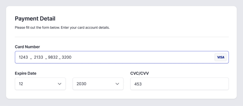
Building trust in visual aspects is as much important as “background” security. Many users may hesitate to provide their address, or make a payment without seeing security signs, so displaying secure checkout or SSL signs must be a common thing.
Recognizable logos, like Visa, Mastercard, Stripe, or other payment walls will keep customers feeling secure throughout the checkout process.
Adding minimalistic products or shop reviews is nice to have, but will help new customers feel safe.
Monitoring
Recently monitoring checkout by errors, crashes, or any unwanted things will help to take care of the website. Few percent of customers leave the cart abandoned, because of errors, or badly designed things.
Testing
Improving the checkout experience is also an ongoing process. Running A/B tests with different layouts helps identify which version works best for your customers.
Implementing analytic tools will provide you with weak points of checkouts. Collecting feedback by surveys is also a popular way to understand the user experience.
Summary
Overall, an intuitive cart design and optimized checkout experience could make a huge difference in abandoned carts. And it could be as much as twice the difference between unoptimized and optimized user experience and design.
By simplifying steps, using clear CTA’s, transparent cost information and adding some information about security, you create a checkout process that feels simple and natural. These strategies will not only improve your conversion but also build trust between customers and the store.

