Animations are gaining popularity in web design, because of their visual appearance. They add a lively, dynamic touch that can make browsing websites feel nice and engaging. However, it’s important to place them with caution because too much movement can not only reduce website performance but also be distracting and annoying for users.
Why should we use animations?
The right amount of animations could add interactivity and bring up the design. Minimal and delayed movements can help catch the attention of users, making them look at certain points.
It’s also nice to the eye. They can improve user experience and engagement through text and pictures. With appropriate use, they could also navigate the user through different sections across the website. The high-quality appearance and interactive features will make the user remember our site.
Types of animation in Elementor
Elementor offers multiple choices of animations. Each one has its own purpose.
It has basic animations (of entering an element/widget/section) by slides, zooming, bouncing, fading, and much more. For example, the title section might slide from left, creating a nice first impression, and catching users’ eye.
It also has other types of animations, like hover and scroll animations. Hover animations, as the name is describing – works, when the user hovers element. It’s often used with buttons, images, or zooming-in sections – for example, images or galleries. Scroll animations are an option, where elements move on scrolling through the website.
It can be text, fade, or even image zoom on scrolling.
Scroll animations are often used to create a parallax effect. It’s an animation, where the whole website feels like it was built in 3D, but it’s not. There are grouped layers and containers, animating live by scrolling down. Each layer has its own animation speed, which creates a realistic 3D feeling, where items are upfront, and in the background.
Best practices in using animations
When customizing your animations, remember about the balance between dynamic visuals, and user-friendly interface. It’s important, to keep animations minimalistic.
Large and distracting movement of elements could be overwhelming. Focus on animating not only whole sections, but also grouped in it elements, each by each. Depending on your goal, you could add animations to CTA, headers, links, buttons, or elements that lead to them.
Keep in mind that too many animations will affect the performance of the website, so it’s really important to keep a balance between them. Light animations are generally better, to keep website time loading, speed, and responsiveness.
How to set up animations in Elementor
Setting up animations in Elementor is a really simple process.
Start, by selecting your element, container, or section. Then in the panel, select tab Advanced, where you’ll find the Motion Effects section, which offers different options to animate, such as entrance or scroll animations.
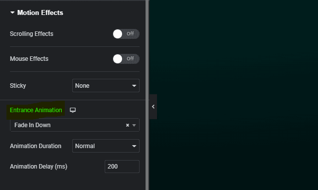
From here, you can also adjust settings like duration, and delay, and control the scroll effect features. Experimenting with these additional settings helps you find the one that you’re looking for.
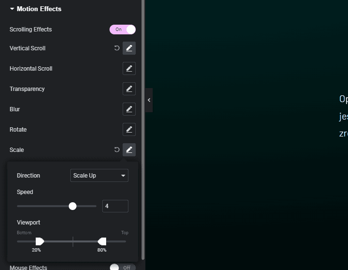
For more effects, consider layering animations by applying different motions to different elements on the same page. However, take care of performance and visual appearance.
Common mistakes to avoid
It’s very easy to make the site overwhelming while adding animations, especially with the variety of options available in Elementor, without even talking about stacking them.
- Over-animating is a common mistake. When too many elements move, it creates a more distracting than pleasing feeling. It’s making users harder to focus on content, by bombarding them with different animations from the start.
- Too fast animations could be another problem. They feel like they are fake and not optimized. You should focus on smooth transitions of entering, or scrolling, which aligns with better user experience.
Testing them across different devices is necessary. Animations, that look great on a desktop, may not work well on mobile devices. Making sure, that everything is correctly set up, gives a nice, user-friendly experience
Examples of good animations
Properly made, animations create an additional touch to the visual appearance and user experience. With fading in sections, listed header after clicking, or commonly used animated buttons. A good example of animation are buttons.
A black button, with white text, should switch to the opposite color after hovering – that means, that the filling from the black is changing to white, while the contour still stays black, marking the button, as white, because on the white website, it won’t be visible. Text, according to filling also changes to the opposite color – from white, on a black background, to black, on a white background.
A good movement is adding a little parallax effect on scrolling, where some background scrolls faster, than some sections, or elements, which adds depth to user experience.
So we have:
- Entry animations
- Hover effects on buttons
- Scrolling effects for background (for each section, or whole parallax effect)
Summary
Overall, animations are a powerful tool, that can add a lot to user experience and visual appearance when used correctly. By selecting the right elements for your website and focusing on the most important containers you can increase your website conversion rate, and provide better-looking pages. The site not only will look more modern but also will encourage users to interact and browse further.
Using animations, you can make your website stand out and also make the user remember the website, because of its well built design.
GET IN TOUCH
Focus on good web design
Let us help you create engaging, user-friendly web experiences.


