Outdated. Confusing. Barely mobile-friendly. That was the state of Hangar31 website when they came to us.
Some time ago, we had a mission to completely modernize the Sport Club Hangar31 website. Our task was to modify the design, improve user experience and integrate advanced functionalities. All this, for making it easier for potential clients to navigate the site and increase conversions.
The previous version was functional, but that was it. It lacked many essential features, design, and user experience. With the new one, we aimed to increase all the things.
We provided clear user interaction, grouped information as a tabs and categories, create whole new menu. We made potential clients to have better understanding of website and move faster, without unnecessary distractions.
Here’s how we redesigned Hangar31’s WordPress site into something simpler, faster, and more useful.
Background and challenges
The old Hangar31 site wasn’t terrible, but it was far from great. You had to dig for info. It didn’t look good on mobile. And it didn’t reflect what the club is really about – a tight-knit community, structured training, and a space where people of all levels feel welcome.
Hangar31 is a sport club based on friendship, and focused on techniques like weightlifting, gymnastics and functional training. The club has wide range of people, from young to less advanced ones. It offers mostly training sessions, targeted to a specific group of people.
Before redesign, Hangar website had basic and outdated design, that no longer meet modern standards. Some of the major issues was UX – poor user experience, lack of design, mobile optimization and outdated as long as insufficient informations.
- Navigation wasn’t intuitive, some tabs were not working properly, and it was hard to find any updated informations. Old design lacks aesthetic, simplicity and engaging graphics or photos.
- There was also no required optimization for mobile devices, website wasn’t responsive as it should, which could be a little frustrating and unprofessional.
- The trainer’s profiles lacked informations, and there was no dedicated space for FAQ.
Redesigning the Hangar31 website
Solution was simple – create a whole new website, which is modern, user-friendly and well designed. Steps, that were made:
- Enhanced design – we made simple, easy to navigate interface. Modern and eye catching color scheme with accessibility to all necessary informations.
- Organized conent – we collect all the content, and grouped it in categories, which we made, as a tabs. By this, users can quickly find membership plans, schedules, calendar or even their class details.
- Integrated social media – we displayed Instagram board, whic is updating in real-time. It helps clients to keep up with the latest news, and could get new conversions on social media.
- Imported online booking – we integrated an external booking system onto Hangar31 site, where users can purchase their memberships, or book trainings online, with secure payment options.
- Improved responsiveness for mobile devices – we ensure, that website is fully optimized for all devices, from desktops, laptops to smartphones.
- Added trainer informations – we made Trainers tab, where you can see all information about the trainer and classes, that he/she provides.
- Introduce FAQ section – we added common user questions, reducing the unnecessary contact for customer support.
New Hangar31 site, section by section
Here’s how each part of the site now works for users, not against them.
Home
The homepage sets the tone. It’s clean, simple, and gets to the point fast.
We created a hero with logo and 3 key features of the club and a CTA button. The header is transparent, which stretched the background all the way up.
Next, we have three About Us section, with different CTA’s – calendar, memberships and trainers. Description contains multi-purpose trainings, personalized coaching and sport club overall mission.
Third section is a place for beginners, where they can read more about the goals, that they could achieve with Hangar, and also buy the trial membership.

Then we have different package options, like weight reduction, build up or similar. All packages contain necessary information like subtitle, description and CTA, which leads to booking system.
Gallery is also a part of homepage – you can see place, gym equipment, trainers and classes in high quality image. We compressed photos to make them suitable for web performance, but also contain enough quality.
Next section is review section. Simple, small, but powerful messages from actual Hangar members. We added a stars, photo and dark background, to make them stand out, from the rest.
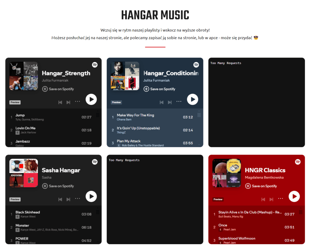
Last one is an integrated Spotify playlist made by Hanga31. Each trainer has its own Spotify playlist, which is provided on home, where you can listen or open it in the app. Different music, different styles for different days.
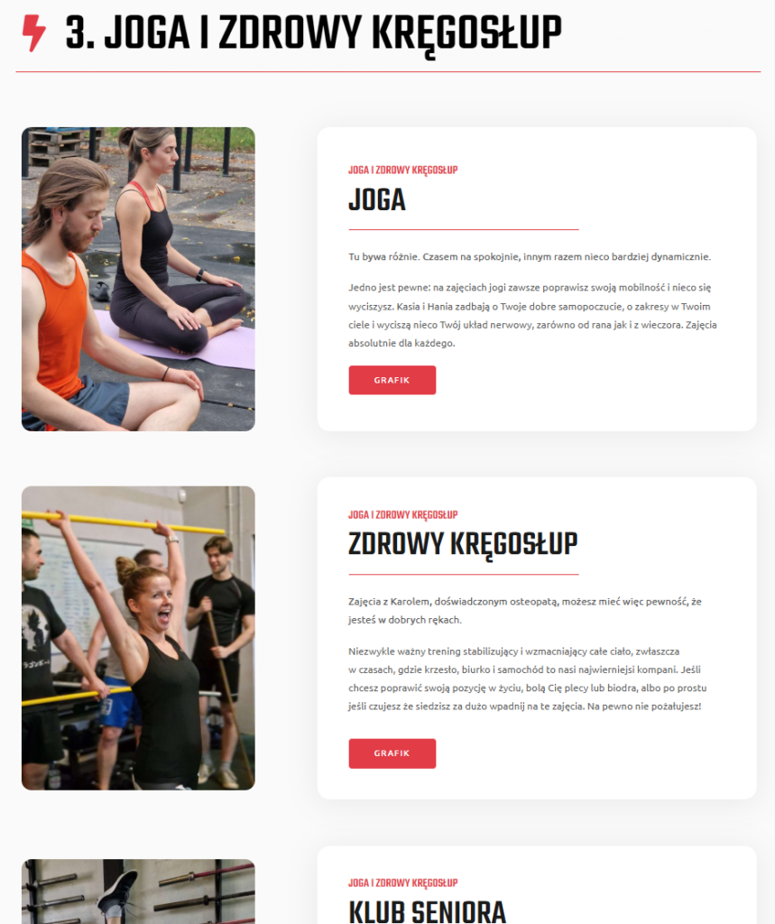
Training sessions
One of the biggest improvements was the detailed class group and descriptions, which is now under Training session tab. It includes high quality image, representing each type of class, as well as detailed description of training session – benefits and focus aerias.
We also add a CTA button for each class, allowing users to purchase the membership instantly from the website. At the top of the page, we placed the table of contest, for quick navigation between different types of classes.

Membership
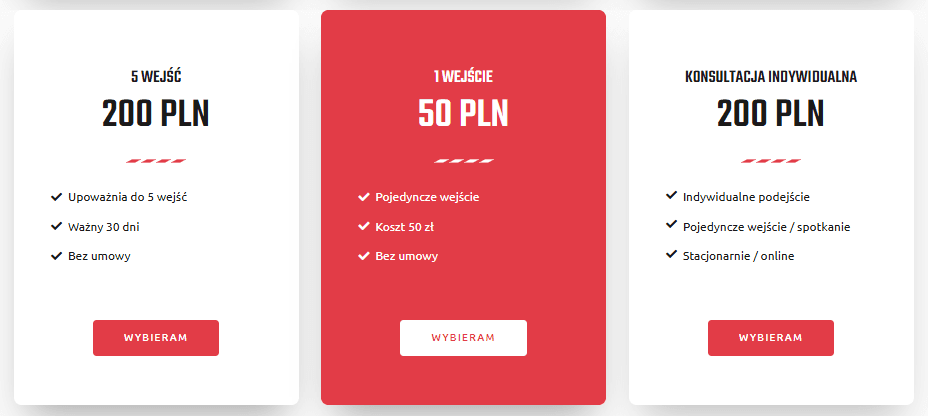
The membership page was completely redesigned, to provide clarity and simplicity.
The clients now have:
- Clear description of each membership in container – time and session based, as well As trial packages
- Imported online booking system (wod.guru) allowing instant booking
- Side by side comparison between other types of membership
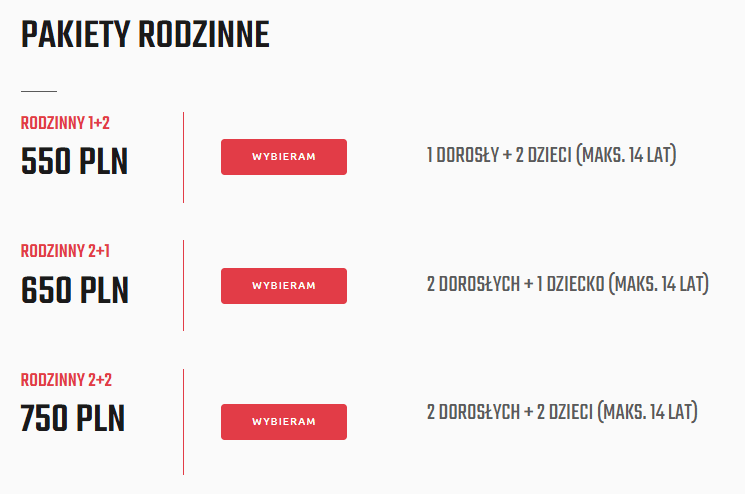
- Family based membership
- FAQ section at the bottom
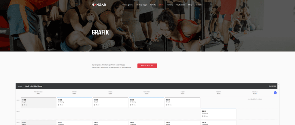
Calendar (workout schedule)
Previous site lacked actual schedule. We integrate online website with club own calendar, which allows users to stay up to date, whenever they open the website.
It’s also mobile friendly designed, which helps users on mobile phones.
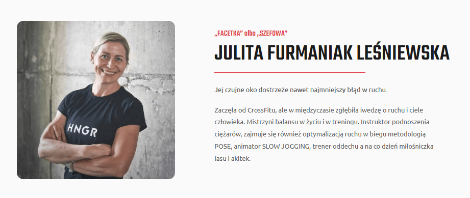
Trainers (Team page)
Old website had limited information and details about the trainers. We ensure, that all necessary information is provided, by creating dedicated profiles for each instructor.
They include professional photos, short bio, qualifications and training method.
The clients can now choose the trainer based on their profiles and goals, and have easier contact with them.
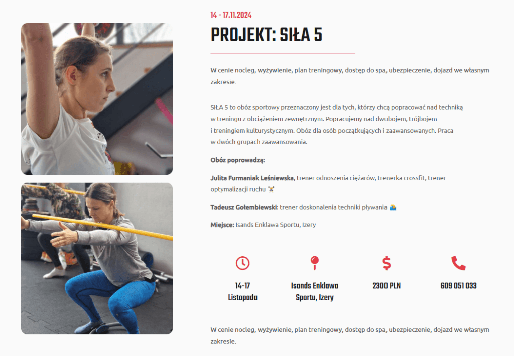
Events
To keep members engaged to the club, we introduced a dedicated tab for upcoming events and training camps. This page contains event descriptions, with cost, date, place and contact information. We added an animated icons, to highlight the key details.
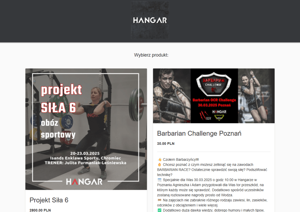
Store – event & challenges
We added a Store button in menu, which leads user to membership store, but in event sections, to purchase tickets for upcoming events, as well as challenges.
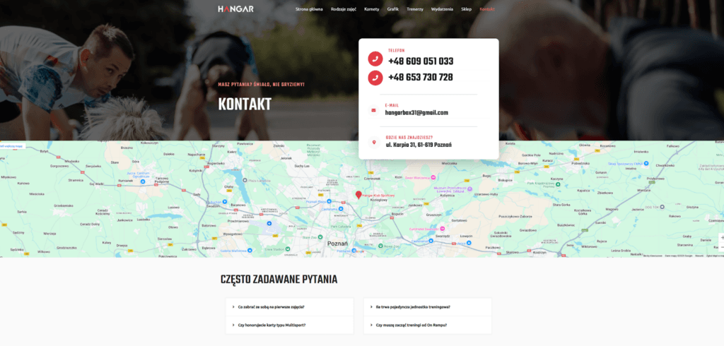
Contact
The new contact us section is now simpler and easier to reach.
The most important – phone numbers and emails are now clearly visible at the top, without forcing user to scroll the page. Big, readable font is all, what we need.
We also displayed Google Map, making it easier for clients to locate and navigate the Hangar31 sport club. At the end, we one more time add a FAQ section.
Summary
The new Hangar31 site doesn’t just look better – it works better.
It’s easier to navigate. Easier to book a class. Easier to understand what the club offers. Visitors get where they need to go faster, and they’re more likely to sign up or reach out.
The site now:
- Supports the club’s business goals – more signups, better communication, less friction
- Feels modern, without trying too hard
- Loads faster, especially on mobile
- Shows real people, real sessions, real value
It’s just what a solid gym website should be: clear, useful, and built around the people who use it.
That’s how we like to do things.
GET IN TOUCH
Got a website that kind of works, but doesn’t really work for your users?
We help businesses turn clunky sites into smooth, high-converting experiences.