Imagine that a customer enters your store wanting to learn more about the product. But the salesperson is nowhere to be found and the most important product details are hidden. Frustrated, they leave without making a purchase.
This is exactly what happens on a poorly designed product page. It’s the digital salesperson for your online store, and it needs to be clear, informative, and engaging to convert visitors into buyers.
Product page design – crucial elements
The product page is important to new clients for many reasons. It’s mainly a page, that “sells” the product or service to the user. It doesn’t need to be minimalistic but must be simple in use, due to different people that will be ordering something.
The most important things in product page design are:
- Title and description position
- Price visibility
- Functional buttons
- Gallery/photos
The most competitive things, especially for potential customers are:
- Price
- Realistic and detailed photos
- Reviews
- Aesthetic page design
Product name
The product or service name must be clearly visible, like a header. It could contain the category, in front of the name. For example: Laptop Dell Inspiron 16.
It will give the feeling of integrating with the product. A big, readable, clear font at the top of the page is the key to success. Make sure, that there is also a lot of white space, to avoid clutter.
The price
It’s a thing, that many people compare on other websites, before finally choosing the one, to purchase from. It should be positioned closely to the CTA “Add to cart” or “Buy now” button, and be as minimalistic, as possible. If there are any discounts, don’t forget to put them in the same spot.
💡Product page design tip: highlight the discount or promotions with color/text size/font-weight
Description
Provide a detailed, but simple description of the product. Highlight the most important things for customers differently than the standard one. For example in boxes with icons, instead of just a text. But don’t forget, to place there also some details and numbers. Some of them could be really useful for clients.
💡Product page design tip: highlight the key features by making a box with icons
Photos & gallery
Make your products stand out from the crowd, by making unique photos. Of course, you should include a professional session, with white background, but you can also add something eye-catching. Make a gallery with a slide, or justify. Position it right next to the title with the description and price. Use the zoom feature, to highlight all the details, hidden in thumbnails.
💡Product page design tip: include eye-catching photos, maybe showing your product in use, and don’t forget to add zoom feature
Add to cart / buy now buttons
Button, that allows customers, to purchase the product. It should be easily visible and stand out from the rest. Locate it next, or close to the price/discount section. You can also add the “Buy now” option right below, or on the side of add to cart, but remember, to highlight the first one. You can make something in a hierarchy style when add to cart is a primary button.
💡Product page design tip: Use bold font, or fill the background with contrasting colors. You can do the opposite for the “Buy now” button. Position it somewhere in the center, so customers don’t have to scroll through the page, to find it. You can also pin it in a bar when scrolling down
Product variations
If the product comes in different sizes, colors, or other variants, it is necessary to be easily accessible for the client. Make sure it is displayed next to the title/description, to get the customer’s attention. After selecting the correct variation, make the picture show the selected product.
Make it clear, simple, and repeatable, so you can do it with all products, whether it’s a color, size, or something else.
💡Product page design tip: Small, and repeatable. You can use the dropdown menu for mobile, or standard boxes. Showing the thumbnail is also a big plus, it can help people to visualize the product.
Reviews
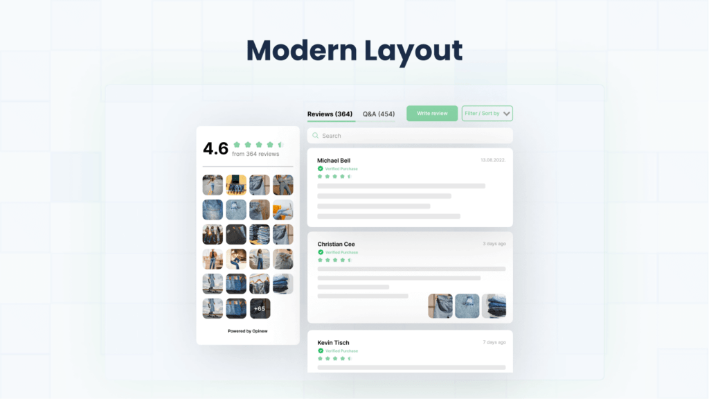
People love to know, what other people think about the product, they are actually buying. Handheld pictures, first opinions, and even more. As in previous things, keep it simple. There is no need to add here complicated stuff. You could also separate the photos, and show them as a mini-gallery on the side. Name, rate, and a few words will be totally enough, like in the example below.
💡Product page design tip: Display the average star rating below the product name, and full reviews below the “main” product hero site. Use a carousel to fit many reviews.
Related / similar products
Showing the additional products, that are related to the product being viewed is also a huge improvement in selling conversion. The customer can explore more options. But don’t make another page, showing the products. You can put them in the carousel, and show 3 or 4 best-selling products, including price and the star review.
💡Product page design tip: Use a carousel format, to display multiple products, related to the actual view, without overwhelming the page layout.
Summary
Remember, a well-designed product page is like a skilled salesperson – it informs, excites, and ultimately convinces customers to hit that “buy” button.
Designing an effective and nice product page is a really long process. Everything – from the title, through the description, up to reviews must be relevant to each other. The fonts, colors, hierarchy, contrast and layout.
There are a lot of different, beautifully and perfectly designed layouts throughout the internet, that you can easily find. You can also make your own – the decision is up to you.
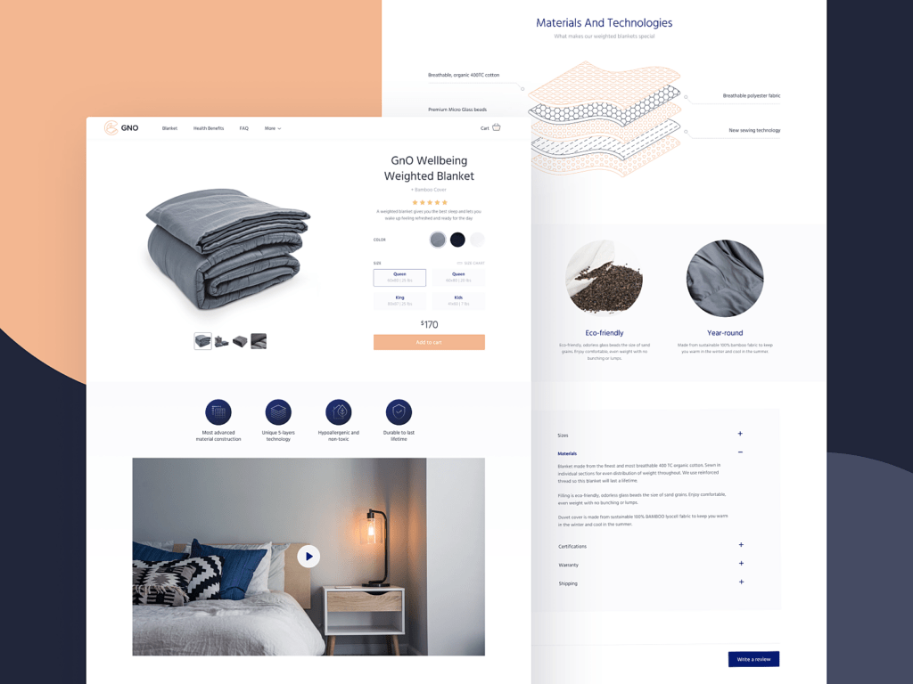
Remember, to add easy-to-read things, intuitive features, and high-quality images. An example of a well-done product page is right below. Good luck with designing your own!!
