Today we’re doing a quick Zeszytowiec.pl e-commerce audit (we mean a “demo e-commerce audit” 😉) to point out the bumps in the road and make sure you’re not hitting the same bumps with your website. Instead of pointing fingers, we focus on learning from mistakes along the way and finding ways to avoid common pitfalls.
This e-commerce audit and blog post happened with the store owner’s green light.
Building a website is a bit like putting together a puzzle—each piece plays a role in the bigger picture. By delving deeper into the experience of Zeszytowiec.pl, you will see what we don’t really like and we will tell you why. The aim? To arm you, the web creator, with insights that can transform your own digital space into a seamless and user-friendly haven.
Consider this a friendly walk through potential e-commerce creation obstacles. Whether you’re a seasoned pro or just dipping your toes into the digital waters, let’s explore the challenges together and pave the way for smoother web journeys. Ready to uncover the secrets of what NOT to do when creating an e-commerce? Let’s dive in! 🚀
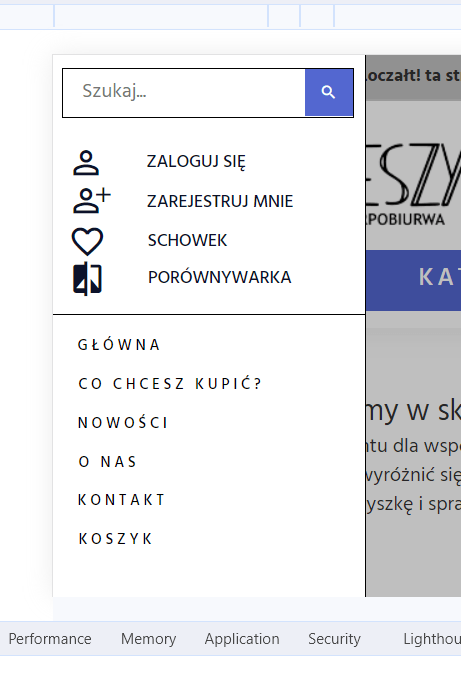
Cookies header
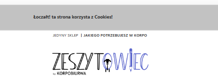
What happened: The cookie message is scattered.
Description: Zeszytowiec.pl’s cookie message lacks a clear and centered presentation, causing visual disarray.
In the same element, the closure is a stylized “x” – it should be an SVG graphic. They are free, e.g. on the website: X Icon | Font Awesome. Style of this x: wrongly centered
The padding of this element is set to 1%, which means that on larger screens the font is comically small compared to the text on the page.
Why it’s a no-go: A tidy first impression matters. Users may find a scattered cookie message off-putting, impacting the overall perception of the website’s professionalism.
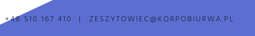
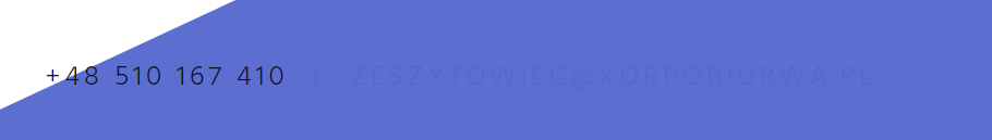
Header headache
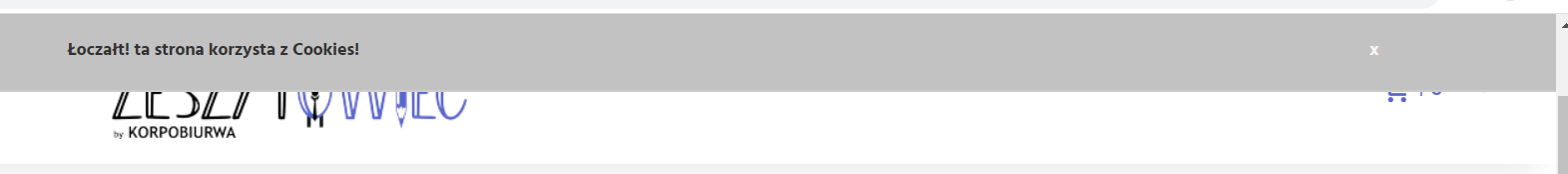

What happened: Important information hides behind the cookie message.
Description: Crucial details are obscured due to their placement behind the cookie message, creating unnecessary user confusion. (Photo 1 has a higher resolution, photo 2 has a smaller resolution.)
Why it’s a no-go: Users shouldn’t play hide-and-seek for essential information. A clear and easily accessible elements are vital for a smooth user experience.
Arrow confusion
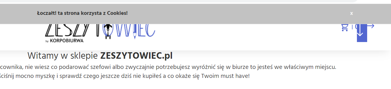
What happened: Arrow cover up important elements and is not centered.
Description: Instead of guiding, arrows on Zeszytowiec.pl overlap with critical elements, hindering user interaction. The arrow above the “Welcome to the zeszytowiec.pl store” section is positioned above the elements in the header, which obscures them. The same arrow is also not centered (even if the stylistic goal was for it not to be, you should add at least minimal padding so that it does not merge with the page)
Why it’s a no-go: Arrows are meant to guide, not obstruct. The overlapping arrows create a distracting and frustrating experience for users.
Mobile confusion
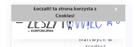
What happened: The cookie message blocks the mobile menu.
Description: Zeszytowiec.pl’s mobile users face an obstacle as the cookie message obscures the mobile menu, impacting navigation.
Why it’s a no-go: Blocking mobile access is a significant usability disadvantage. Mobile-friendliness is crucial for a seamless user experience.
SEO fail
What happened: The header messes with SEO.
Description: Zeszytowiec.pl’s header is not optimized for SEO, potentially impacting the site’s visibility on search engines. What’s more, it causes difficulties for people using the reader on the website. The header should be an H1 tag to properly set the page hierarchy.
Why it’s a no-go: Clear header tags contribute to better SEO. Neglecting this aspect could result in lower search engine rankings.
H(X)ierarchy devastation


What happened: Headers are scattered, causing confusion.
Description: Zeszytowiec.pl lacks a clear hierarchy in its headers, potentially leading to confusion regarding the structure of the website.
Why it’s a no-go: Both users and search engines benefit from a well-organized hierarchy. Confused users may bounce off the site, impacting its performance.
Properly organizing page content is crucial for both SEO and user comfort. While a reader can navigate through paragraphs and lines, the failure to appropriately structure content for both Google bots and users can lead to suboptimal SEO and user experience.
To illustrate it, Zeszytowiec.pl should consider the following headers distribution: Begin with an H1 heading, welcoming users to the store with a brief paragraph that serves as a concise introduction for both the bot and the reader (e.g., “Witamy w sklepie zeszytowiec.pl”). As users scroll, the subsequent H2 heading, such as “NEW STUFF,” signals the presence of products, creating a logical and user-friendly flow informed by a well-organized hierarchy.
Navigation nonsense

What happened: Google (or visually impaired/blind user with a reader) is confused with the wrong tags.
Description: Zeszytowiec.pl misuses tags, potentially confusing search engines and users about the site’s structure.
Why it’s a no-go: Proper navigation is key for SEO and user comprehension. Misusing tags can harm both aspects, impacting the site’s performance. Using the section tag has a significant impact on how Google interprets the content structure. When employed incorrectly, such as for a navigation section, Google may perceive it as a content section detailing the page’s creation. This mislabeling can lead to decreased SEO performance because Google understands that individuals using a screen reader may struggle to discern the presence of subpages due to the navigation section having an inappropriate tag. The absence of the correct tag impedes effective communication with both users and search engines, emphasizing the importance of utilizing appropriate HTML tags to enhance accessibility and SEO.
Search silliness
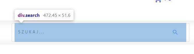
What happened: The search bar plays hard to get.
Description: The search functionality on the website falls short of user-friendly standards. Instead of a straightforward search bar, users are initially presented with a feature that requires interaction with the blue area before entering a search phrase. This extra step in the process can be confusing and counterintuitive, contributing to a less-than-optimal user experience.
Why it’s a no-go: An efficient and user-friendly search option should be immediately accessible, allowing users to input their search queries without unnecessary steps, enhancing overall website usability.
Tab trap
What happened: Tab key navigation hits dead-ends.
Description: Zeszytowiec.pl’s tab navigation doesn’t provide a smooth journey for non-mouse users, potentially causing frustration.
Why it’s a no-go: Accessibility is crucial. A website should prioritize inclusive design, ensuring smooth navigation for all users, irrespective of their preferred input method.
Padding predicament
What happened: Uneven padding between products.
Description: The inconsistency in padding between products on the website is noticeable, with a discrepancy between the vertical and horizontal spacing. While there is a 10px padding vertically, the horizontal spacing is set at 16px. This misalignment in padding can result in an uneven and disjointed appearance of product displays, affecting the overall visual harmony and professionalism of the website.
Why it’s a no-go: Consistent padding is crucial for a visually pleasing and user-friendly design. Poorly chosen padding can affect the overall aesthetics and user experience.
Error in footer
What happened: Footer links merge, causing confusion.
Description: The issue of blending links in the footer, both before and after, creates a visual challenge for users. The transition from white to blue in the color scheme, particularly concerning the phone number, makes it difficult to discern the text clearly. This lack of contrast can impede legibility, potentially causing user frustration and hindering navigation.
Why it’s a no-go: It’s essential to maintain a consistent and readable color scheme throughout the footer, ensuring that links and text remain clearly distinguishable for a more user-friendly experience.
Subscription style
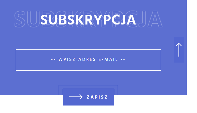
What happened: Lack of visual cues for subscription elements.
Description: Zeszytowiec.pl’s subscription elements lack clear styling, making it confusing for users. The absence of styling to clearly indicate the purpose of two elements—those designated for subscription and the “Enter email address” input—poses a usability concern. Users may struggle to differentiate these elements visually, leading to potential confusion. The lack of evident cues can result in situations where users attempt to register, causing frustration due to the unclear interface.
Why it’s a no-go: Clear visual cues are crucial for guiding users. Confusion around subscription elements can hinder user engagement.
Subscription snag

What happened: Error message after attempting to subscribe blends with the background.
Description: Zeszytowiec.pl’s error message lacks contrast, impacting readability.
Why it’s a no-go: A clear contrast is necessary for effective communication. Poor visibility of error messages can lead to user frustration.
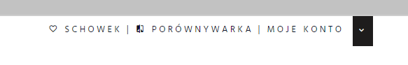
Contact information (in)consistency
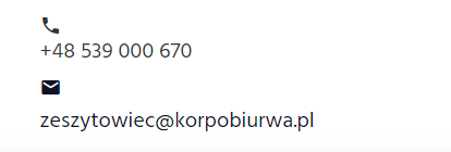
What happened: Lack of alignment and styling uniformity for phone and email icons.
Description: While Zeszytowiec.pl’s contact icons appear neatly aligned on mobile devices, the same styling and alignment uniformity are not maintained on desktop screens, introducing an inconsistency in the design.Zeszytowiec.pl’s contact icons lack consistency, affecting the overall professional look.
Why it’s a no-go: It’s important that things look the same across different devices. When they don’t, it can make the website seem less organized and professional. Keeping things consistent helps the site look better and work well for everyone, no matter what device they’re using.Consistent styling contributes to a cohesive and professional appearance. Inconsistencies can detract from the website’s professionalism.
Missing mobile menu closure
What happened: Lack of a visible element for closing the mobile menu.
Description: Zeszytowiec.pl lacks a clear way for users to close the mobile menu, potentially frustrating mobile users.
Why it’s a no-go: Clear navigation options are crucial for a positive mobile user experience. A missing closure option can lead to frustration.
Category sorting snag
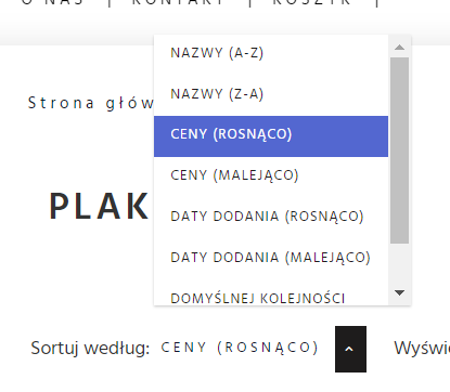
What happened: Category sorting opens a dropdown but fails to close it.
Description: Zeszytowiec.pl’s category sorting creates a clunky user experience by not closing the dropdown.
Why it’s a no-go: Smooth interaction is crucial for a positive user experience. Clunky features can frustrate users and impact engagement.
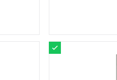
Product list nightmare

What happened: List-style product display is potentially problematic.
Description: Zeszytowiec.pl’s list-style product display may lead to a poor user experience. The accessibility sign should not take up space, it should be divided into 3 parts, part with the image, part with the title and part with the price. The green check mark would be in part of the image as an element overlaid on this element.
Why it’s a no-go: Opting for a grid-style presentation is often more visually appealing and streamlines the browsing experience for users. A poor product display impacts the overall user experience and engagement.
Conclusion
Remember, your online platform is more than just a collection of pages; it’s a virtual storefront inviting visitors to explore and engage. Learning from the hiccups of others is a powerful strategy, ensuring your web design sails smoothly, offering users a seamless and enjoyable experience.
Zeszytowiec.pl has its own cool vibe, even though we pointed out some things to work on. We appreciate what they’re offering, and you should explore their services. Every online store has its good and not-so-good parts, and Zeszytowiec.pl is on a path of continuous improvement.
If you’re eyeing your e-commerce venture and thinking, “I want to get this right,” fear not. Our comprehensive e-commerce audit services are designed to delve deep into the intricacies of your website, ensuring it doesn’t fall into the traps we’ve highlighted today. Let us be your compass in the vast sea of e-commerce design/creation process, guiding you towards a website that not only avoids common pitfalls but truly thrives.
So, if you’re ready to elevate your online presence, learn from the mishaps, and set sail toward digital success, reach out to us. Consider this article your invitation to a conversation—a conversation that could transform your website into a beacon of excellence in the vast ocean of the internet. Let’s build something amazing together!


